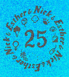
The Twentyfifth Anniversary Logo
 For our 25th anniversary, we had a party and a family reunion.
The extended family (about 30 of us) went to Marine World-Africa USA.
This is the the logo that Nick designed for our T-shirts. The
background started as teal.
Starting at 12 and moving clockwise, we have:
- a trefoil (for Girl Scouts)
- a cats paw
- a dome tent
- an orienteering control
- a computer mouse
- the Big Dipper and North Star (for astronomy and Alaska)
- grapes (for wine)
- a feminist symbol
- a (chocolate) ice cream cone
- a California golden poppy.
For our holiday card, we transposed this idea onto a wreath. The
symbols were (in the order as above):
- a patch from the navy aGS dult uniform and a Silver Award pin
- two clip-on cats
- a minature Coleman lantern and a miniature knife (which says
25 - Nick & Esther)
- an orienteering control
- a calculator (for the computer)
- the Big Dipper and North Star
- a bottle of (honest, it really is) Cabernet Sauvignon labeled Esther & Nick 1971
- a peace symbol and two half globe earrings (hey, we use what we've got)
- Hershey's chocolate (milk chocolate for s'mores, Special Dark for
what we like)
- a cable car
- And we threw in a teddy bear.
Return to my home page.
Esther A. Heller, Independent Consultant and Trainer
<esther@galarc.com>
San Francisco Bay Area, California
Last updated January 2, 1997